Visualizing Your Study Log
Learning Objectives
- You can add a plotting layer to the study-log project from Using Libraries.
- You can keep loading, DataFrame preparation, summary preparation, and plotting separate.
- You can implement charts for subject totals, daily totals, and session lengths.
- You can test plotting helpers with tiny DataFrames.
This chapter is the project checkpoint. You will add a small visualization layer to the study log.
The project already knows how to load sessions, create a DataFrame, and compute pandas summaries. Do not replace that structure. Add plotting helpers beside it.
The required DataFrame shape is still:
subject, minutes, dateThe required charts are:
- total minutes by subject,
- study minutes over time,
- distribution of session lengths.
Keep the Layers Separate
The project should have one function that creates the DataFrame from sessions:
df = sessions_dataframe(log.sessions)Plotting helpers accept that DataFrame. They should not read JSON, ask for input, or save the study log. Each helper prepares the summary it needs and draws one chart.
This separation keeps the project readable:
JSON file -> Session objects -> DataFrame -> summary table -> chartEach arrow has one job.
The examples below use this six-row checkpoint fixture:
| subject | minutes | date |
|---|---|---|
| math | 45 | 2026-05-12 |
| history | 30 | 2026-05-10 |
| math | 60 | 2026-05-10 |
| programming | 25 | 2026-05-11 |
| programming | 90 | 2026-05-13 |
| writing | 40 | 2026-05-11 |
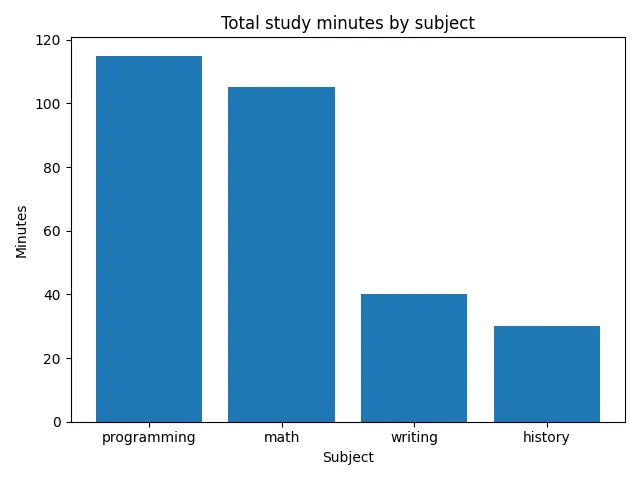
Subject Totals
Before plotting, the subject helper should produce this summary:
| subject | minutes |
|---|---|
| programming | 115 |
| math | 105 |
| writing | 40 |
| history | 30 |
Use this implementation checklist:
- Group the rows by
subjectand summinutes. - Put the totals in descending order.
- Create a figure and axes, then draw one bar per subject.
- Use the required title and axis labels.
- Return
(fig, ax).
Daily Minutes
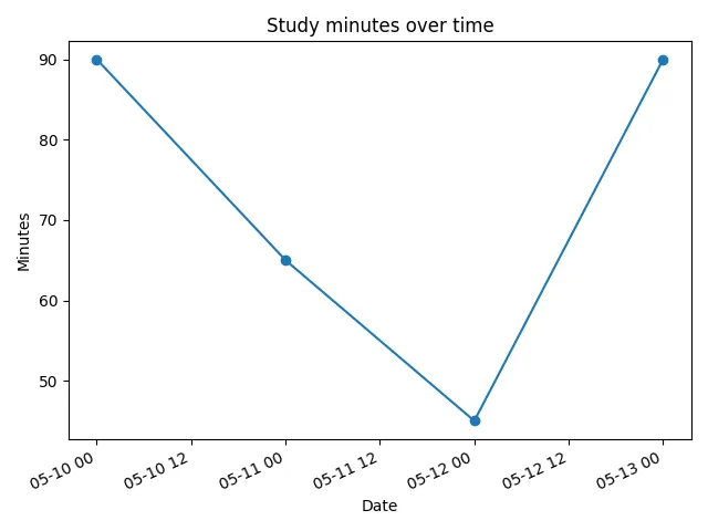
The daily helper should prepare one row per date in chronological order:
| date | minutes |
|---|---|
| 2026-05-10 | 90 |
| 2026-05-11 | 65 |
| 2026-05-12 | 45 |
| 2026-05-13 | 90 |
Use this checklist:
- Work without changing the input DataFrame.
- Convert
datewithpd.to_datetime. - Group by date and sum
minutes. - Put the dates in chronological order.
- Draw a line chart, set the required labels, and return
(fig, ax).
Session Lengths
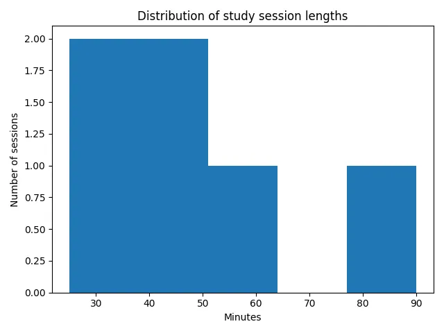
The histogram uses the six original session lengths:
45, 30, 60, 25, 90, 40It should use five bins. Do not group the rows first: every original session contributes one value to the distribution.
Use this checklist:
- Create a figure and axes.
- Draw a five-bin histogram from the
minutescolumn. - Use the required title and axis labels.
- Return
(fig, ax).
Saving the Charts
The plotting helpers return their figures so the caller controls what happens next. For example, the caller can save and close one chart:
fig, ax = plot_subject_totals(df)fig.savefig("subject_totals.png")plt.close(fig)Use the same pattern for the other two helpers when you connect them to the full project.
Empty Data
If the DataFrame is empty, the functions should still return a labeled chart. It may have no bars, no line points, or no histogram bars. That is acceptable for the helper layer.
In the user-facing program, you can choose to skip saving charts when there are no sessions:
if len(df) == 0: print("No sessions to visualize yet.")else: save_visualizations(df)That keeps the user experience friendly without making every plotting helper responsible for printing messages.
Testing the Helpers
Start with the six-row fixture above instead of connecting the helpers to your real file immediately. Compare the prepared values and charts with the tables and images in this chapter.
Ask the same questions you have used throughout this material:
- Does the chart answer the intended question?
- Did the helper prepare the right summary first?
- Are the labels readable?
- Can you explain what the chart shows and what it does not show?
The exercise below practices the plotting layer with a plain DataFrame. In your full project, connect these helpers to the DataFrame produced from your StudyLog.
Study log visualizations
0 / 20 points
Implement the plotting helpers for the Data Visualization study-log checkpoint.
This exercise practices the visualization layer with a plain pandas DataFrame. In your full class-based study log, create this DataFrame from your Session objects first, then pass it to these plotting helpers.
The input DataFrame has columns subject, minutes, and date. The tests pass a DataFrame shaped like this:
df = pd.DataFrame([ {"subject": "math", "minutes": 45, "date": "2026-05-12"}, {"subject": "history", "minutes": 30, "date": "2026-05-10"}, {"subject": "math", "minutes": 60, "date": "2026-05-10"}, {"subject": "programming", "minutes": 25, "date": "2026-05-11"}, {"subject": "programming", "minutes": 90, "date": "2026-05-13"}, {"subject": "writing", "minutes": 40, "date": "2026-05-11"},])Define these functions:
plot_subject_totals(df): create a bar chart of total minutes by subject, grouped withgroupbyand sorted from largest total to smallest.plot_daily_minutes(df): create a line chart of total minutes per date, sorted by date.plot_session_lengths(df): create a histogram of session lengths using theminutescolumn. You can draw it with matplotlib’sax.hist(...)or seaborn’ssns.histplot(...); either is fine.
Use these exact chart labels:
- Subject chart: title
"Total study minutes by subject", x-axis"Subject", y-axis"Minutes". - Daily chart: title
"Study minutes over time", x-axis"Date", y-axis"Minutes". - Histogram: title
"Distribution of study session lengths", x-axis"Minutes", y-axis"Number of sessions", with five bins.
Each function should:
- accept the DataFrame as its only argument,
- prepare only the summary it needs,
- create a matplotlib figure and axes,
- set the exact title and axis labels listed above,
- return
(fig, ax), - not call
input(...), - not print anything,
- and not call
plt.show()inside the function.
For plot_daily_minutes(df), convert date with pd.to_datetime without changing the input DataFrame. Working on a copy is one way to preserve the input.
Empty DataFrames with the expected columns should still return labeled figures without raising an error. In your full project, the user-facing code can decide to skip saving charts when there are no sessions.
Finally, do what the charts are for: read them. Write a short interpretation of each of your three project charts.
Interpret your three project charts
0 / 10 points
Your Data Visualization project checkpoint produces three charts: total minutes by subject, study minutes over time, and the distribution of session lengths.
Write a short interpretation of each chart, about two or three sentences per chart, based on your own study-log data. For each chart, say what it shows, what it does not show, and one conclusion you can or cannot honestly draw from it. The sentence range is guidance, not a strict limit.
If your own log is still small, you may base the interpretations on the sample DataFrame from this chapter’s Testing the Helpers section instead. Say so if you do.
Before Moving On
By the end of this checkpoint, your project should still have the textual summaries from Using Libraries. The new charts are an addition, not a replacement.
The study log has grown carefully across the course: interaction, repetition, functions, files, summaries, JSON, classes, pandas, and now visualizations. Keeping the layers separate is what lets the program keep growing without becoming one giant script.
AI Study Aid
Create a chapter diagram
We're looking into to what extent AI-generated diagrams could help with studying.
Use this study aid to generate an AI-generated visual summary of the material you just studied.
Each diagram style emphasizes the content in a different way, so you can choose the focus
that feels most useful.
Using the diagram generator is voluntary and does not affect your course progress. We encourage
you to try it out and see if it helps, but it's totally up to you! Your answers help us understand
how to make better study aids in the future.