Distributions with Histograms
Learning Objectives
- You can explain what a distribution shows.
- You can use a histogram for numeric durations.
- You can interpret common ranges and unusual values cautiously.
- You can avoid claiming causes from a histogram alone.
Sometimes the question is not about categories or dates. It is about the shape of one set of numbers.
How long are my commutes usually?This chapter uses a small sample of commute records so you can practice the chart with a context outside the study log:
import pandas as pd
records = [    {"mode": "bus", "minutes": 18, "date": "2026-05-04"},    {"mode": "bike", "minutes": 22, "date": "2026-05-05"},    {"mode": "bus", "minutes": 25, "date": "2026-05-06"},    {"mode": "train", "minutes": 27, "date": "2026-05-07"},    {"mode": "bus", "minutes": 32, "date": "2026-05-08"},    {"mode": "bike", "minutes": 35, "date": "2026-05-11"},    {"mode": "train", "minutes": 48, "date": "2026-05-12"},    {"mode": "bus", "minutes": 70, "date": "2026-05-13"},]
df = pd.DataFrame(records)
The relevant values are the commute durations:
durations = df["minutes"]A histogram groups numeric values into ranges and counts how many values fall into each range.
import matplotlib.pyplot as plt
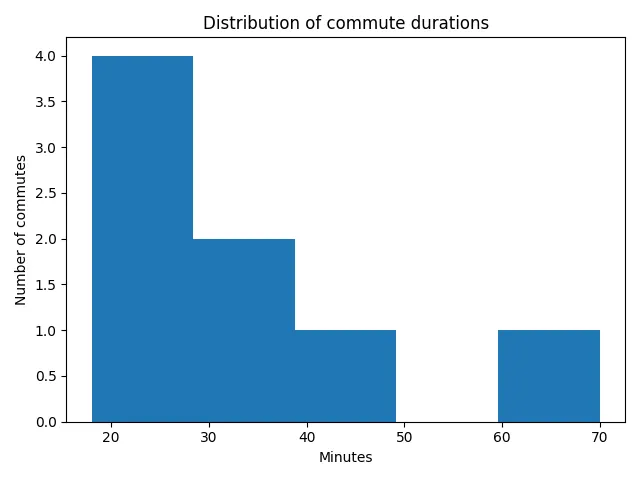
fig, ax = plt.subplots()ax.hist(df["minutes"], bins=5)ax.set_title("Distribution of commute durations")ax.set_xlabel("Minutes")ax.set_ylabel("Number of commutes")plt.show()
The bars in a histogram are not categories like transport modes. They are numeric ranges. One bar might count commutes from 18 to 28 minutes. Another might count commutes from 28 to 38 minutes.
What a histogram shows
0 / 5 points
What does a histogram of the commute minutes column show?
Reading a Histogram
The commute durations in this chapter’s sample are:
[18, 22, 25, 27, 32, 35, 48, 70]A histogram can show that most commutes are under 40 minutes and one commute is much longer. That is useful. It gives you a quick sense of the shape of the data.
But it does not tell you why the 70-minute commute happened. There may have been a delay, a different route, or simply a longer trip. The chart shows a pattern. Your interpretation has to stay honest.
Good histogram interpretations sound like this:
Most commutes in this sample are between 18 and 35 minutes,with one longer commute around 70 minutes.They do not sound like this:
The histogram proves that taking the bus always causes long commutes.The second sentence makes a claim the chart cannot support.
Common Mistake: A Histogram of Transport Modes
A histogram belongs to one numeric column. Passing a text column instead is a common slip:
ax.hist(df["mode"], bins=5)Depending on the library version, this either fails or draws something that looks like a chart but means nothing: transport modes are not numbers, so they do not form numeric ranges, and “five bins of transport modes” is not a real question.
If the question is about transport modes, that is a category comparison, and a bar chart of a suitable grouped summary may be more useful. Keep the two ideas separate: bar charts compare categories; histograms show the shape of one numeric column.
Now compare all three chart types in your own words: histograms for numeric distributions, bar charts for categories, and line charts for ordered change.
Compare histograms, bar charts, and line charts
0 / 10 points
In a short paragraph, compare histograms, bar charts, and line charts.
Make one reasonable comparison between a histogram and a bar chart, and one between a histogram and a line chart. You may instead explain a suitable purpose for each of the three chart types. Concise answers are welcome; the important part is choosing a meaningful role for every chart.
Histogram of transport modes
0 / 5 points
What is wrong with this line?
ax.hist(df["mode"], bins=5)Then assemble a labeled histogram yourself, one line at a time.
A labeled commute-duration histogram
0 / 5 points
Arrange the blocks to draw a labeled histogram of commute durations. Assume df already exists with columns mode, minutes, and date.
Create the figure before drawing on its axes. The independent title and label calls are grouped into one block.
Bin Counts
The bins argument controls how many ranges the histogram uses:
ax.hist(df["minutes"], bins=5)With a tiny dataset, changing bins can change the chart a lot. That does not mean one version is lying and the other is true. It means histograms are summaries. Like every summary, they leave out some detail.
The same commute values can look more or less detailed when the number of ranges changes:
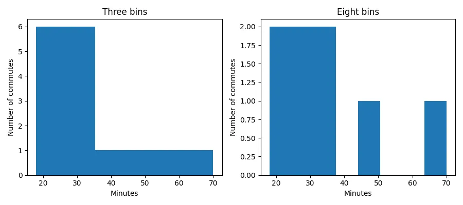
Keep the bins simple. You do not need a perfect binning rule. You need enough bins to see whether durations are mostly clustered, spread out, or unusual in some obvious way.
The bins argument
0 / 5 points
What does the bins argument in ax.hist(df["minutes"], bins=5) control?
Empty and Tiny Data
Histograms are not very useful when there are no values or only one value.
For an empty DataFrame, a plotting helper can still return an empty labeled chart, or the calling program can print a message and skip plotting.
For one commute, the chart can show where that one value falls, but do not over-interpret it. One value is not a pattern.
The same lesson keeps returning: visualizations summarize data. If there is not much data, there is not much pattern to summarize.
Now apply the histogram pattern to parcel-delivery durations, including the empty case.
Delivery-duration histogram helper
0 / 10 points
Define a function named plot_delivery_durations(df).
df is a pandas DataFrame with columns carrier, duration, and date. The duration values are delivery times in minutes.
The function should:
- create a matplotlib figure and axes with
plt.subplots(), - draw a histogram of the
durationcolumn using the axes and five bins, - set the title to
"Distribution of delivery durations", - set the x-axis label to
"Minutes", - set the y-axis label to
"Number of deliveries", - and return
(fig, ax).
Example input:
df = pd.DataFrame([ {"carrier": "North Parcel", "duration": 12, "date": "2026-05-04"}, {"carrier": "Quick Box", "duration": 18, "date": "2026-05-05"}, {"carrier": "North Parcel", "duration": 31, "date": "2026-05-06"}, {"carrier": "City Courier", "duration": 58, "date": "2026-05-07"},])For an empty DataFrame with those columns, return the labeled figure as usual; the histogram simply has no visible bars.
Do not call input(...), do not print inside the function, and do not call plt.show() inside the function.
Check Your Understanding
- What question does a histogram of the commute
minutescolumn answer? - How is a histogram bar different from a category bar in a bar chart?
- What does the
binsargument change, and why can it change how the chart looks? - Why is “most commutes are between 18 and 35 minutes” a more honest claim than “the histogram proves the transport mode caused a long commute”?
The project later applies the same idea to study-session lengths. The context changes, but the histogram still groups one numeric minutes column into ranges.
AI Study Aid
Create a chapter diagram
We're looking into to what extent AI-generated diagrams could help with studying.
Use this study aid to generate an AI-generated visual summary of the material you just studied.
Each diagram style emphasizes the content in a different way, so you can choose the focus
that feels most useful.
Using the diagram generator is voluntary and does not affect your course progress. We encourage
you to try it out and see if it helps, but it's totally up to you! Your answers help us understand
how to make better study aids in the future.